
16 Sep Is the Wonton Font a Racial Stereotype?
NOTE: This is a re-publication of a Nikkei View blog post I wrote back in 2009, which an article in the New York Times linked to this week. The original version was on an older site and the images had been unlinked (and the food festival that inspired the original post has evolved into the Far East Fest, which was canceled in 2020 because of Covid and doesn’t seem to have been held in 2021). So I’ve decided to copy and paste the text and update the post here.
I know I’m climbing on my soap box and risking being called over-sensitive and too p.c. But when I noticed a promo on Facebook over a decade ago for an “Asia Food Fest” in Austin, Texas, and saw the logo for the event, my stomach clenched just a little bit. The words were spelled out in the “Wonton” font, the curvy, pointy — shall I say, “slanty” — lettering that I associate with a lifetime of Asian racial caricatures.
I hate it when non-Asians use it as a way of appearing “Asian,” and I’m disappointed when Asians use it thinking that non-Asians will identify with it. Austin’s Asia Food Fest, which I’m sure was a wonderful event, was organized by the Texas Asian Chamber of Commerce, Texas Culinary Academy, and SATAY Restaurant (one of my favorite restaurants anywhere, and one I visited every year for a decade when I attended the South By Southwest music festival — it sadly closed in 2016), so it wasn’t a phony, faux-Asian affair. The website no longer exists, but here’s how the Fest was started, from its About page:
Dr. Foo Swasdee, owner of SATAY Restaurant, founded the ASIA Food Fest in 2006 to educate people about Asian ingredients, food, and cooking. As Austin Asian population grows (doubling every 10 years), the more choices Austin Asian Food Lovers have to choose from!
But the logo still bummed me out, so I tried to reason my reaction out internally.
When I see the font, I hear the words spoken in my head in the sing-songy “ching chong” sound that I grew up hearing in racist chants, like when white kids taunted me in school, and told me to “go home” or “go back to China” (they never said go back to Japan, which would actually have been correct, since I was born in Tokyo).
I think of words in anti-Asian or anti-Japanese signs. I see Wonton and I see the words “Jap,” “Nip,” “Chink,” “gook,” “slope.” I can’t help it. In my experience, the font has been associated too often with racism aimed at me.
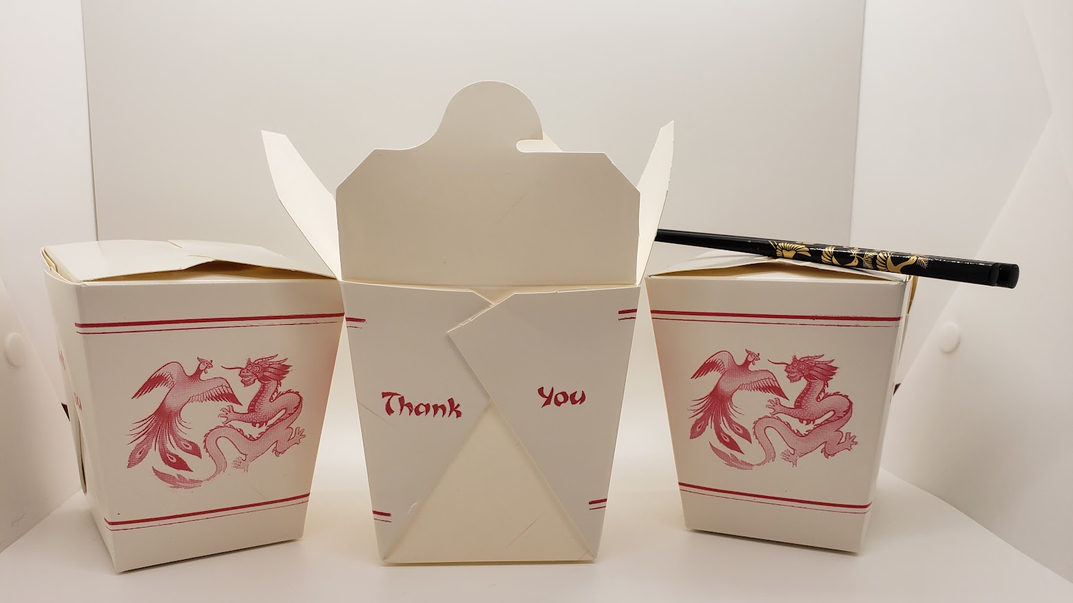
Which is not to say it’s always racist. Wonton’s used all over the place, and a lot of times I zone it out. Chinese takeout boxes often have something written in the font. Many Asian restaurants (with old signs and menus) still use it. But then some old-timer Asian groceries still say ‘Oriental” too. We allow for that, but as we move forward we expect those uses to fade.
Times change, right?
Fonts are created by graphic designers to capture in an instant the essence of a feeling, an association. Paul Shaw in Print magazine published a history of the Wonton font. Former New York Times reporter Jennifer 8. Lee, who authored of “The Fortune Cookie Chronicles,” a great book that looks at Chinese food in America, cited Shaw in an article that these fonts were originally designed by Asians to attract customers to their businesses.
So that’s an important point, it was not as though Americans were imposing the font on the Chinese. It was the entrepreneurs who were choosing it, as it was an efficient (and cheap) way to say “Chinese” without pagodas and dragons.
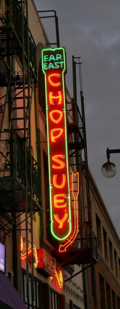
Because the dish was a popular staple of Chinese American restaurants in the 1900s, Chop Suey signs were popular examples of the font, writes Shaw in his article:
By the ’30s, chop suey letters were being used to promote Chinese restaurants across the country. Chop suey, the dish, invented 40 years earlier, had become a culinary craze. Restaurants responded by including the dish in their name and emphasizing it in their signs and advertising. This can be seen in surviving neon signs—Guey Lon Chop Suey Restaurant in Chicago, Pekin Café Chop Suey in San Diego, and the Joy Young restaurant in Birmingham, Alabama—as well as in postcards and matchbooks from the ’30s through the ’60s.
The sign for the Far East Chop Suey Cafe (now run as a modern restaurant, not the diner that was popular for many decades) in Los Angeles’ Little Tokyo is a designated historic landmark, and was restored a few years ago to its original glory, with its gentle Wonton font neon beaming out into the night.
Shaw also writes:
Ethnic type — not just chop suey but all of the varieties — survives for the simple reason that stereotypes, though crude, serve a commercial purpose. They are shortcuts, visual mnemonic devices. There is no room for cultural nuance or academic accuracy in a shop’s fascia. Restaurant owners want passersby (often in cars rather than on foot) to know immediately that they serve Chinese (or Greek, or Jewish) food, and a lettering style that achieves this is welcome.
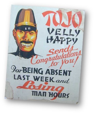
So the font grew out of a marketing need, and is still used that way (though thankfully, less often than it was in 2009 when this essay was first written). But it had been co-opted by racists during the Yellow Peril era of the late 1800s and early 1900s, when Asian immigrants in general (but particularly Chinese) were demonized, and during World War II, when Japanese were demonized.
I grew up with the heritage of that racism, and can’t shake those associations whenever I see the font even in innocent uses.
When my wife Erin and I were on the operating committee of the Colorado Dragon Boat Festival from 2001-2007, we tried to be sensitive to these issues. We avoided Wonton in all the festival’s signage, collateral material, public relations and marketing. We found other fonts that evoked Asia without the baggage (Papyrus, for one, and various calligraphic fonts that look like brush writing). Here’s a CNN article from April, 2021, asking the question whether these “chop suey” fonts have seen the end of their usefulness. (YES!)
I think it’s time to retire the Wonton font forever.
It’s not cool to use “Oriental” to describe Asian people today (rugs are still okay, I suppose). Rosie O’Donnell was once castigated for making “ching chong” sounds on TV, and so have other celebrities including Shaquille O-Neal, when he was interviewed about Yao Ming… here’s my 2009 post about it. People famous and not have been criticized for publicly (on social media) posting photos mocking Asians by pulling back their eyes. Duh — so third grade. Words like the “n” word and the “ch” word that were commonly used a century ago have been banned by anyone who isn’t racist. Things have changed.
A lot of things that weren’t necessarily racist or ethnically stereotypical are no longer acceptable today, because they evoke the racism of the past. Wonton is a product of the past, and there should be no place for it in the future.